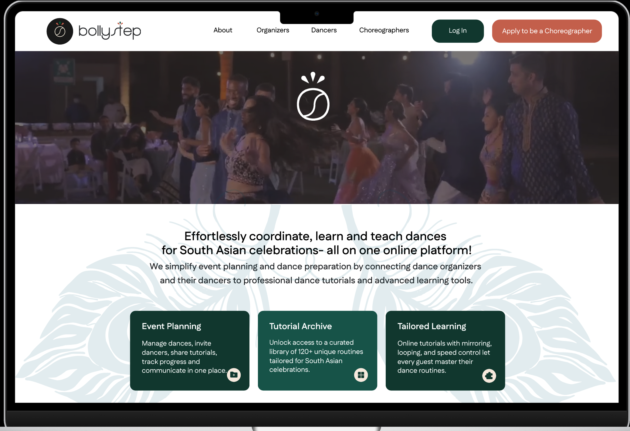
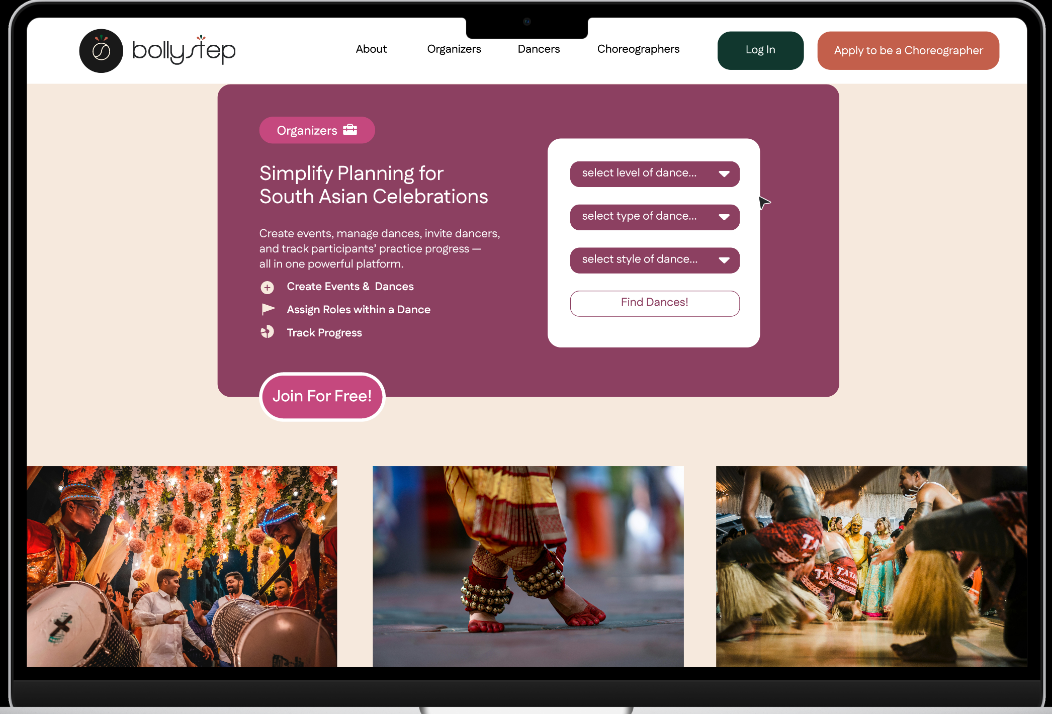
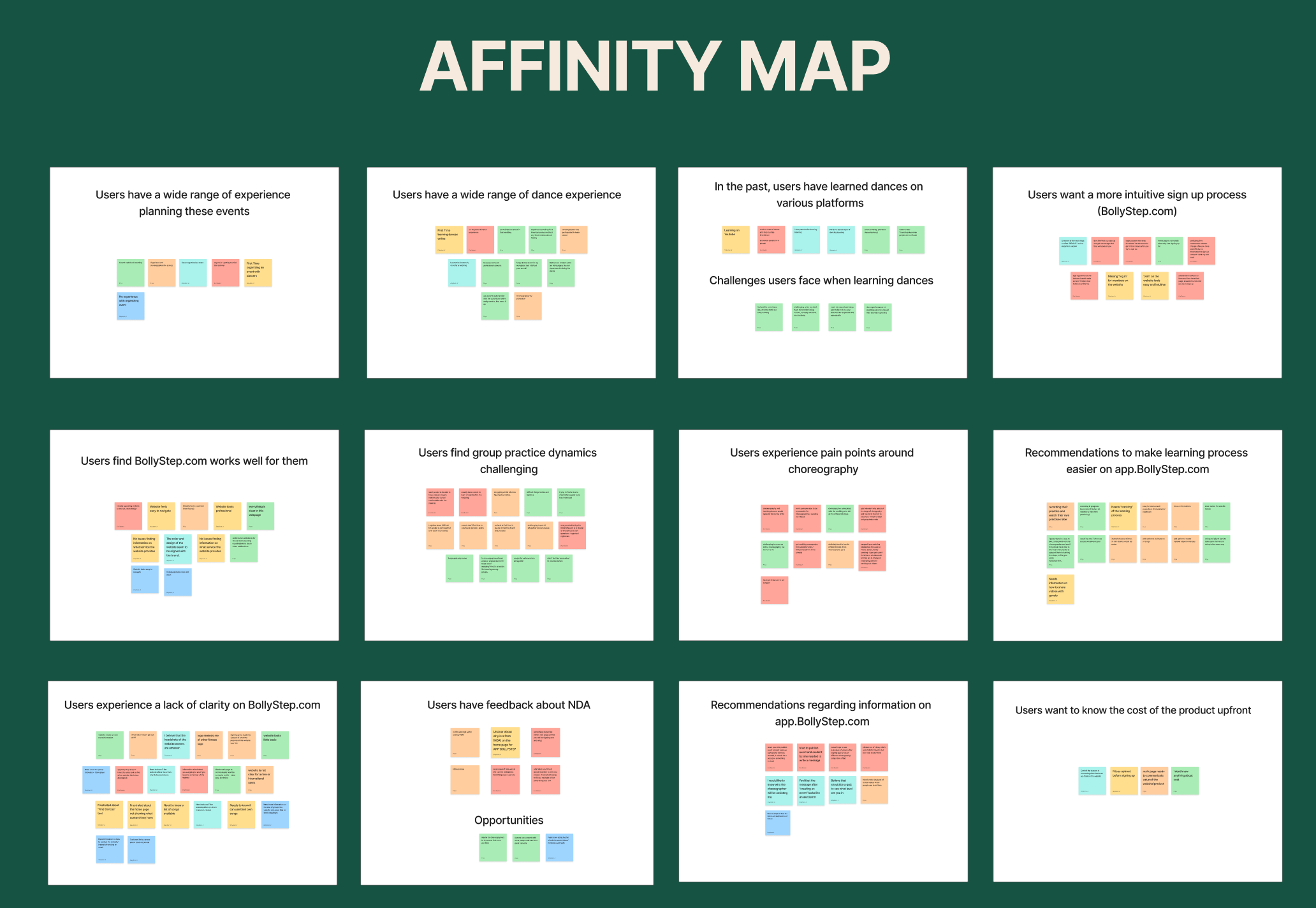
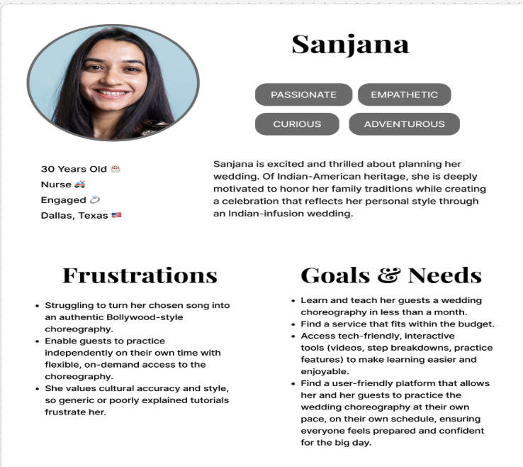
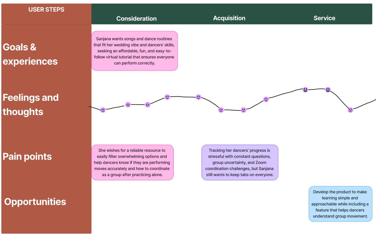
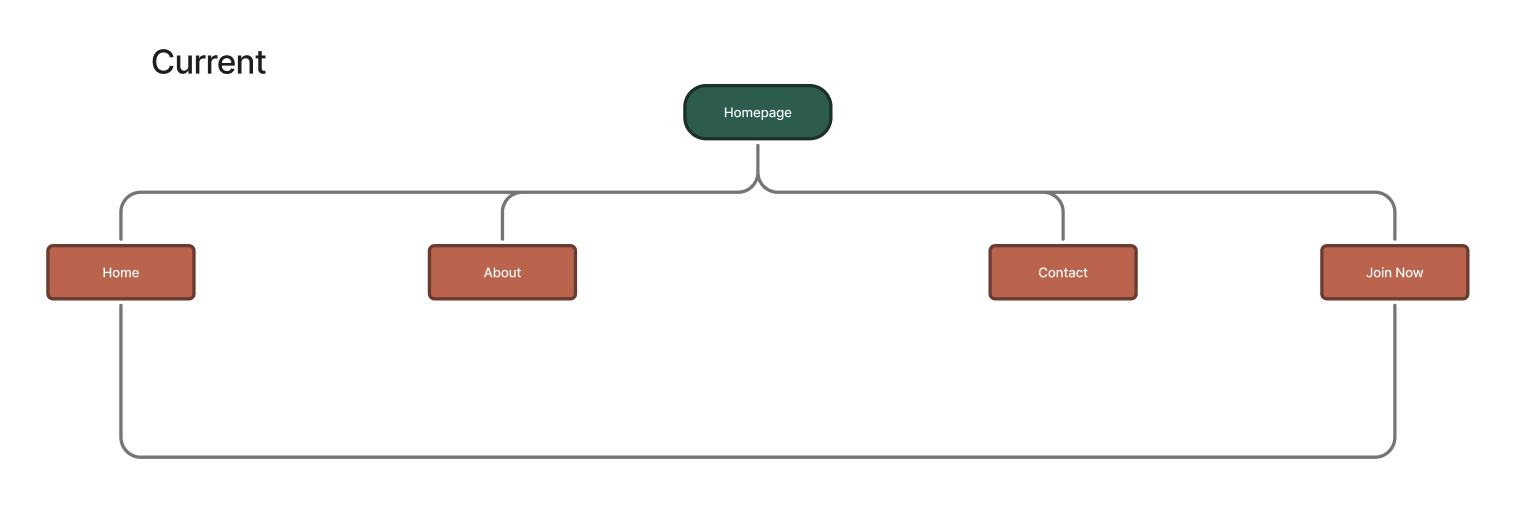
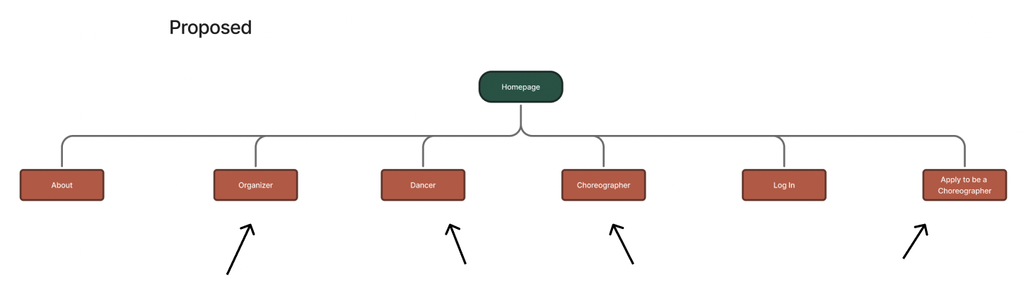
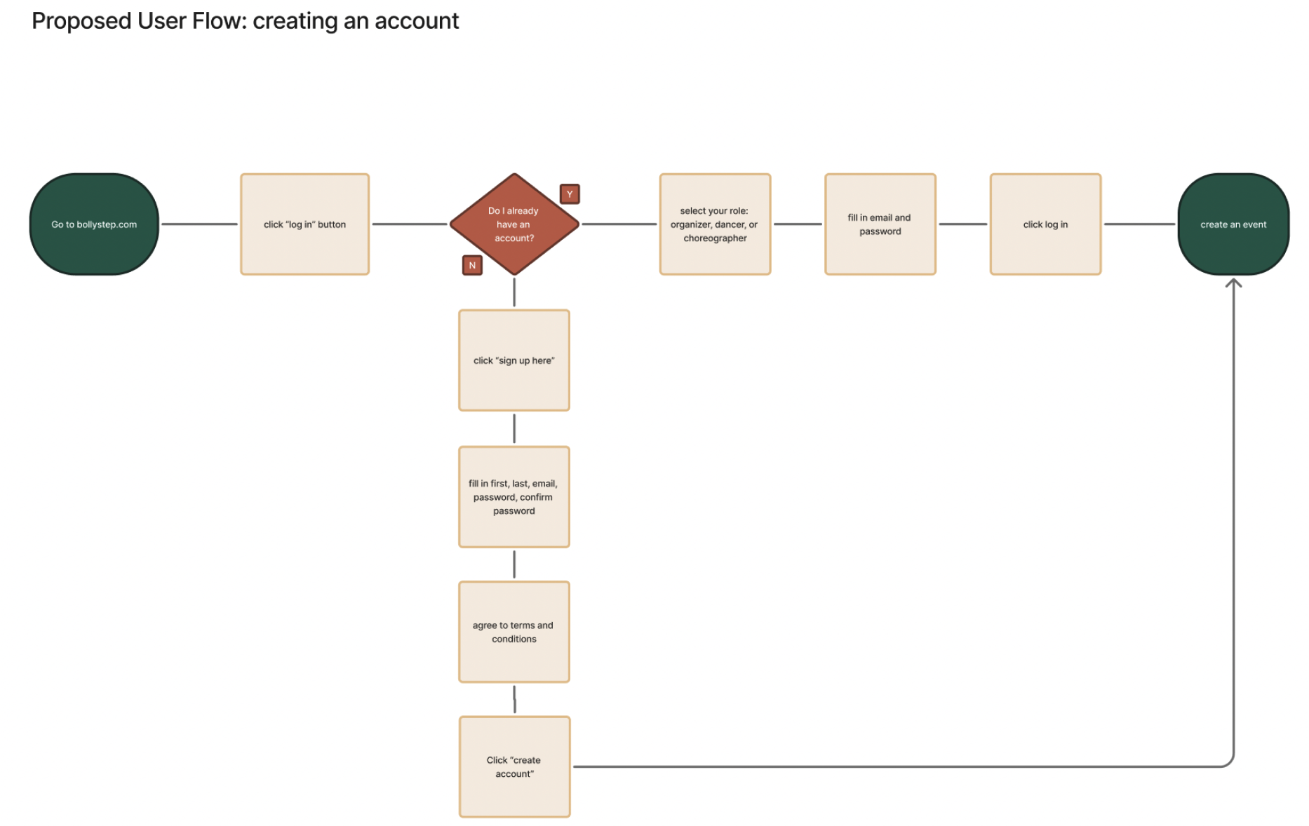
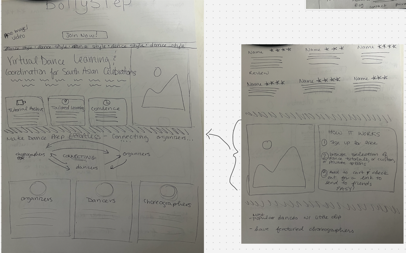
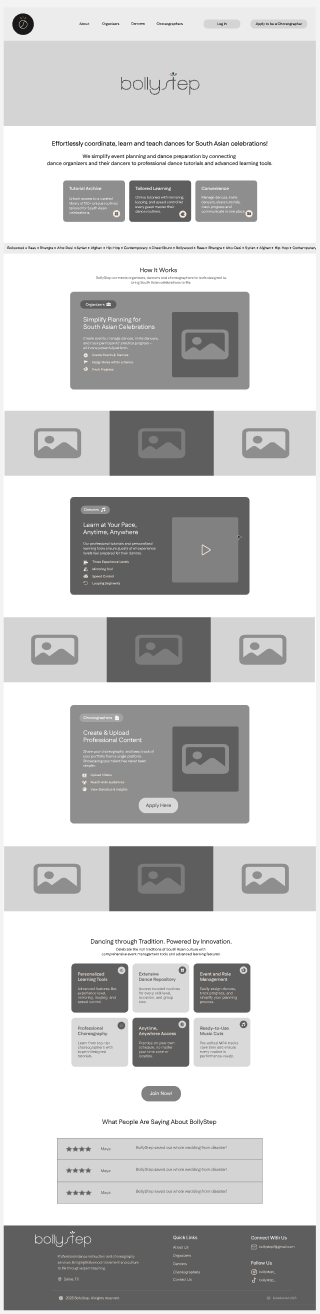
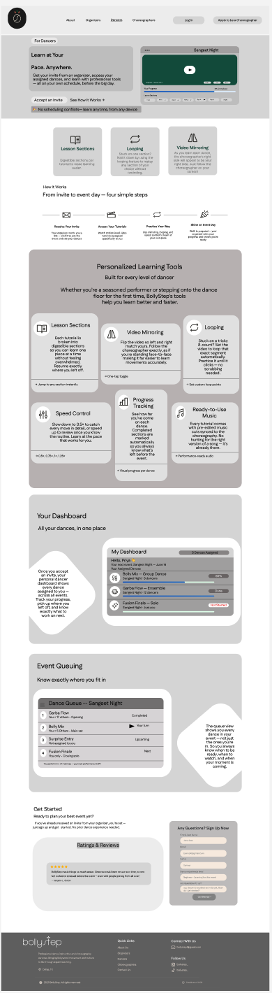
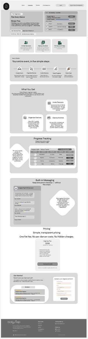
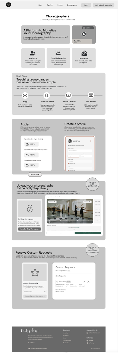
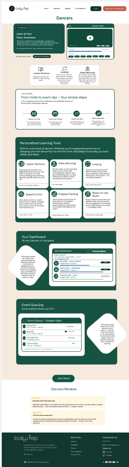
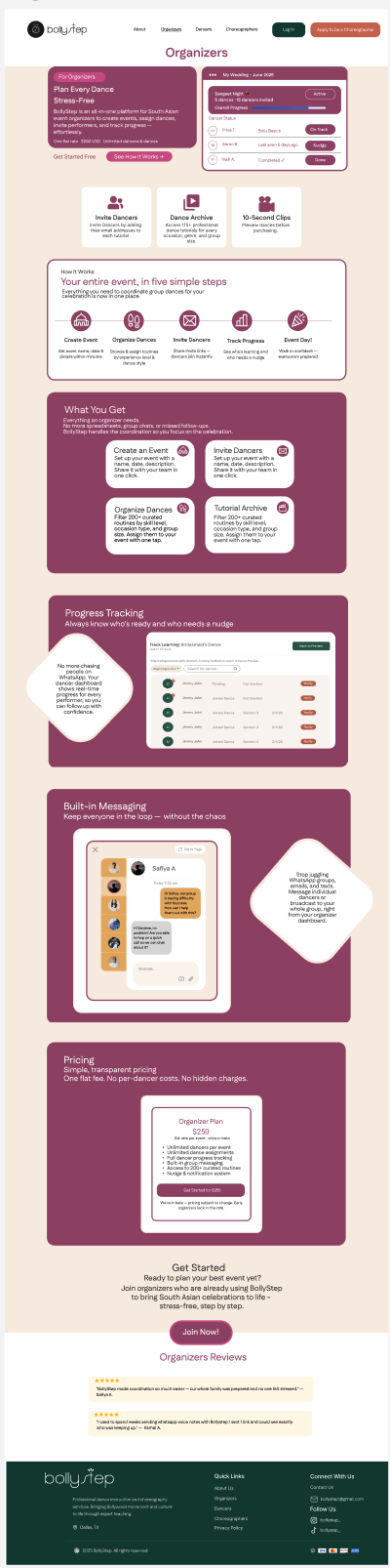
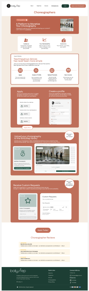
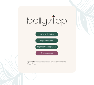
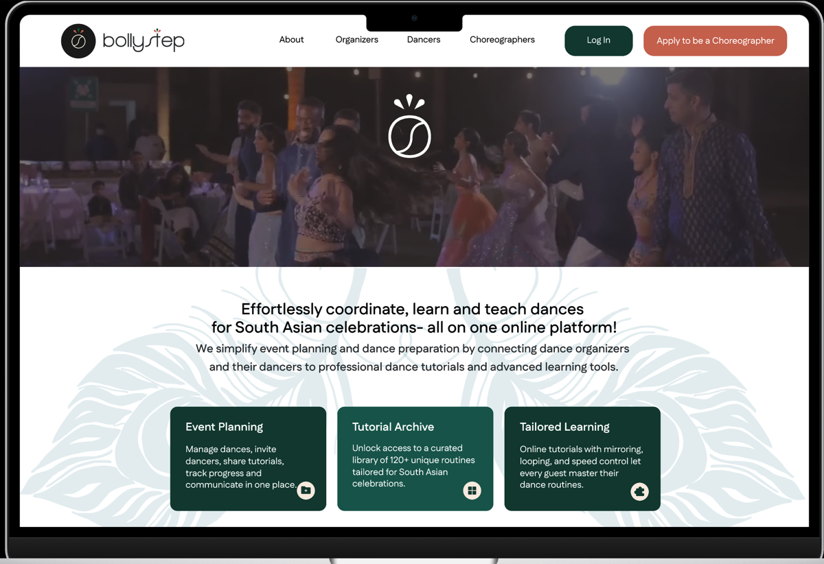
BollyStep
My capstone. Three weeks, three user types, and one big assumption I had to throw out early.
My RoleUX Researcher & Designer
Timeline3 Weeks
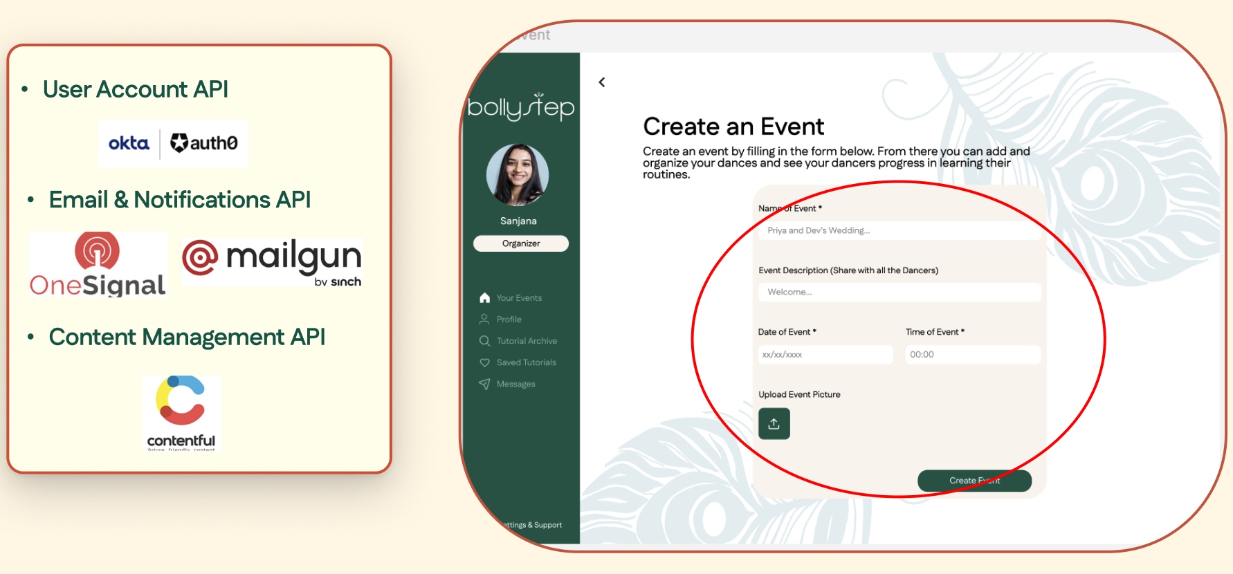
PlatformLive Beta Web
ToolsFigma · FigJam · Jira
Scroll
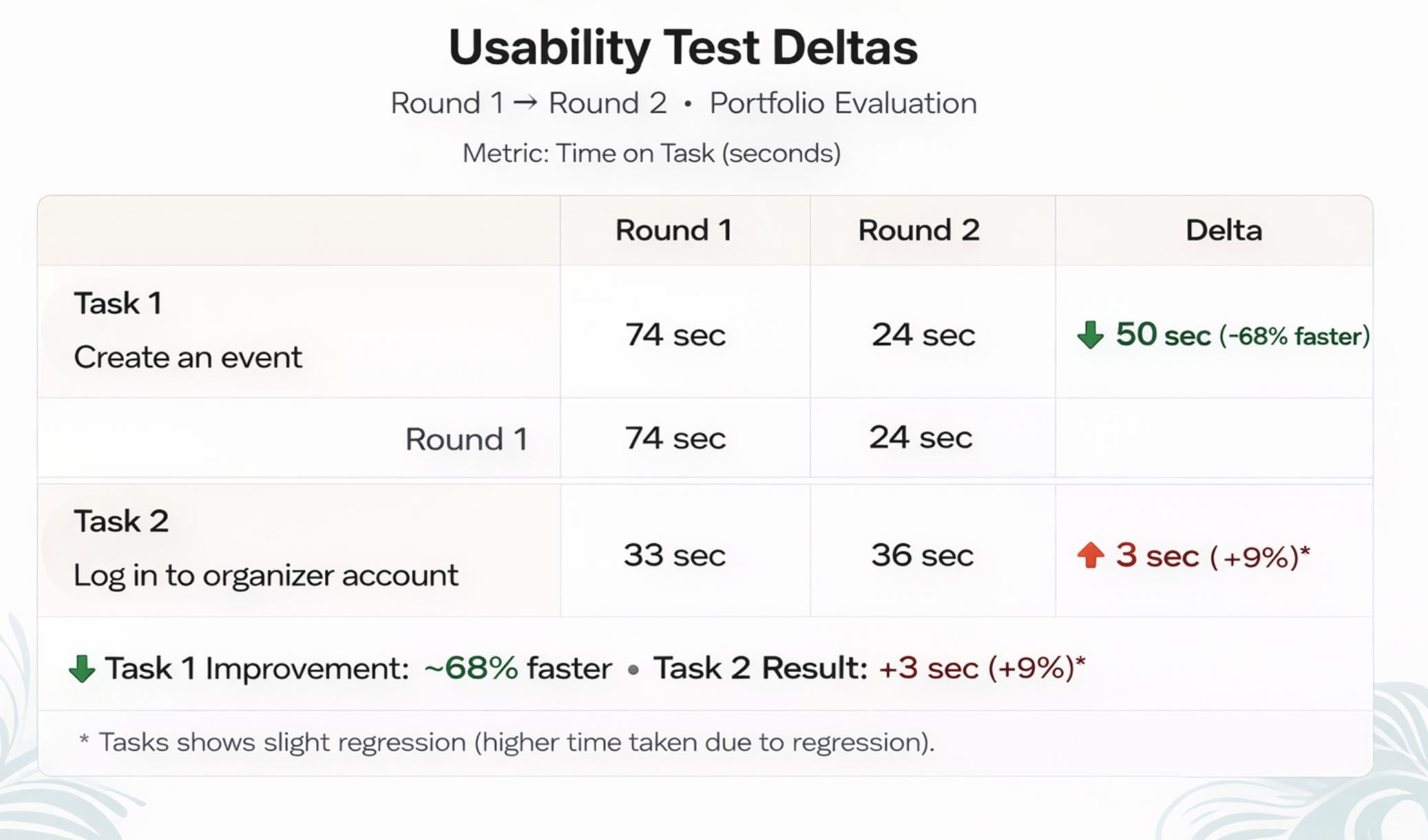
3×
Faster tasks
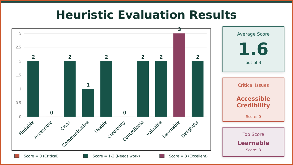
87
SUS Score
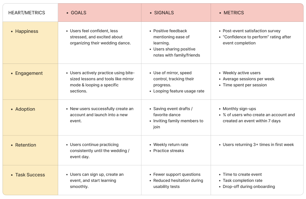
100%
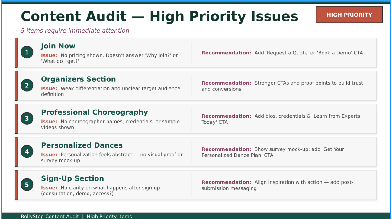
Pricing clarity