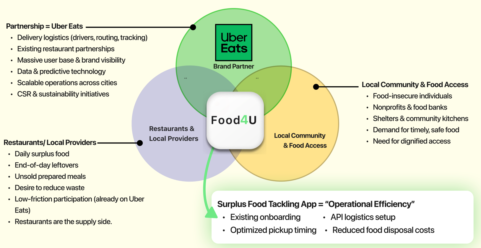
Food4U
A team project. Three weeks. And the moment I realised designing one app for two very different users doesn't work.
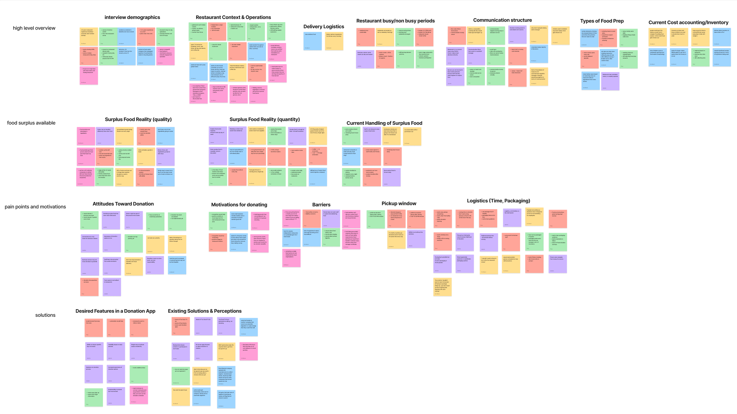
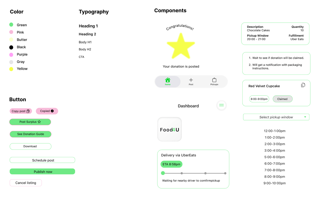
My Role
UX Researcher & Designer
Lead on research, flows & final design
Timeline3 Weeks
PlatformNative Mobile App
ScopeResearch → Design → Testing
Scroll
Food4U · Native App
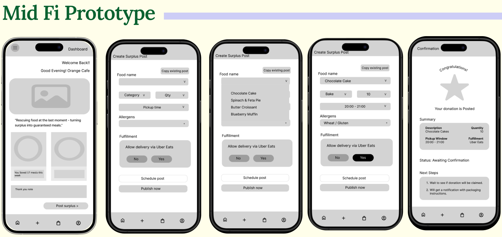
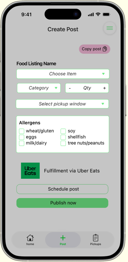
<60s
Post time
1-tap
Repost
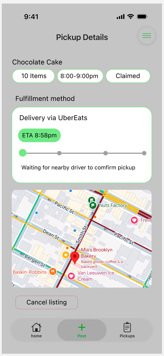
0
Logistics calls