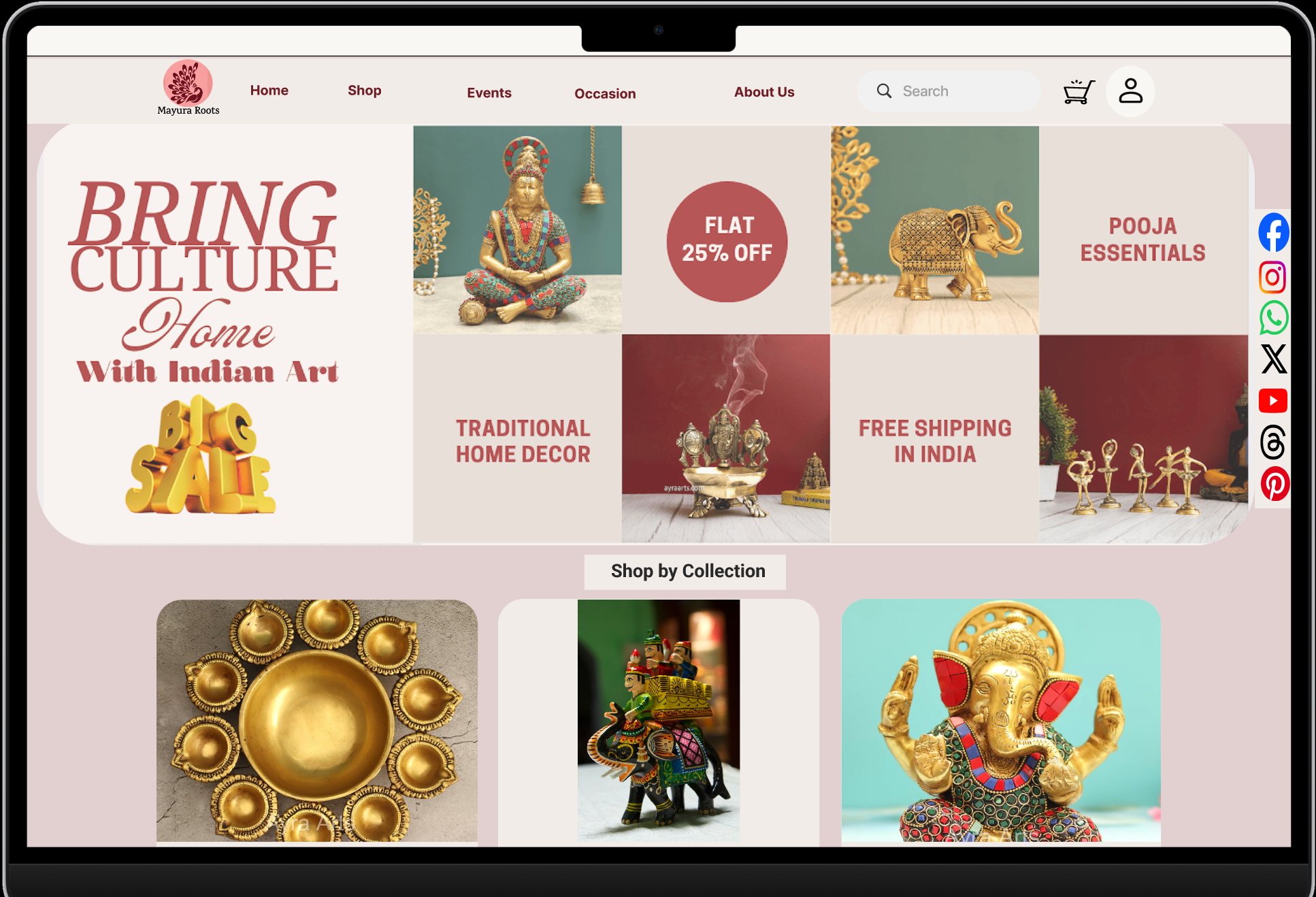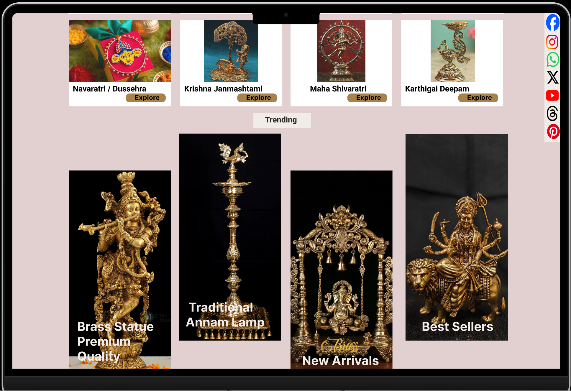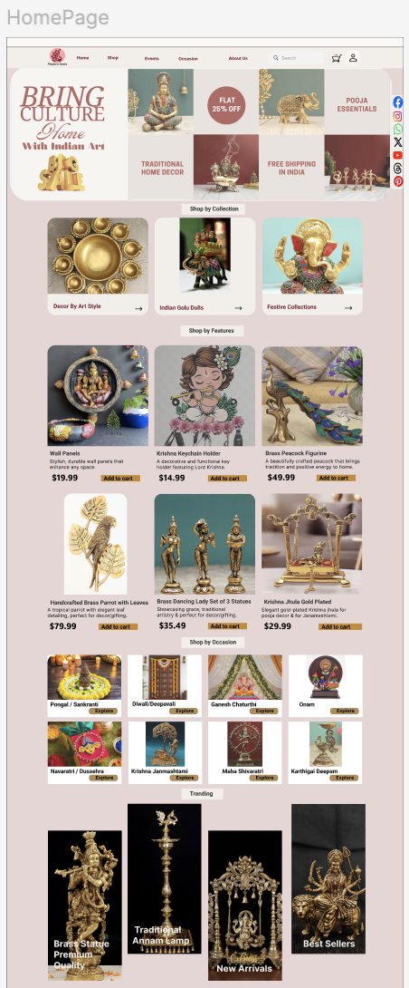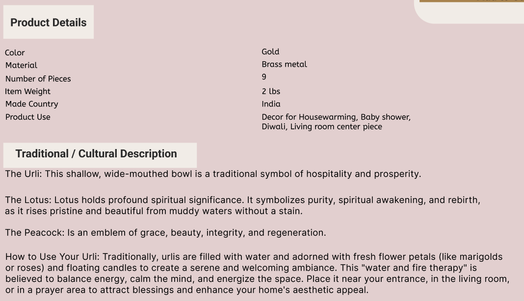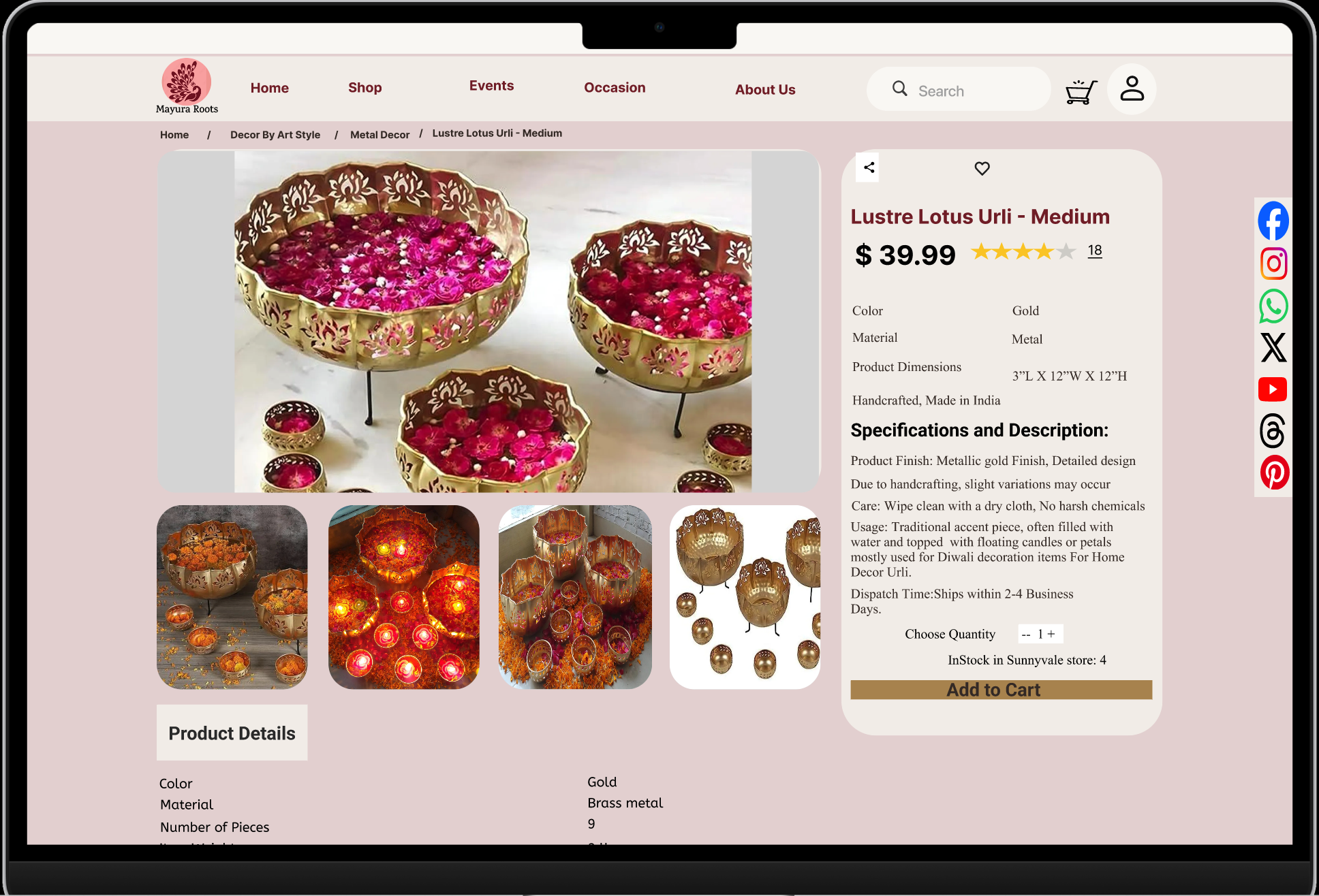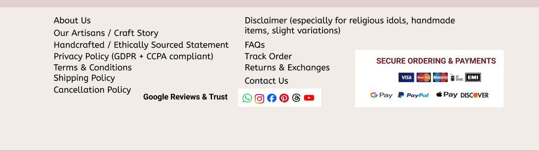
Mayura Roots
The project that taught me category labels are a design decision - and that "logical" categorisation is usually just the designer's logic, not the user's.
Role
UX Research · IA · UX Design
Timeline
3 Weeks
Platform
E-Commerce Website
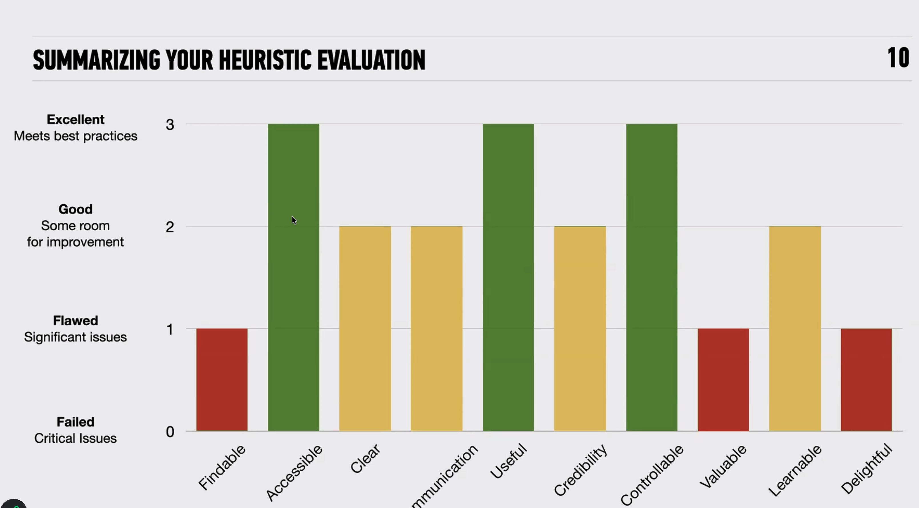
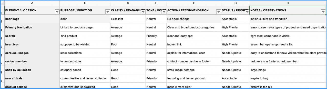
Method
Double Diamond
Tools
Figma · FigJam · Jira · Google Workspace
Scroll